Industry Insider: The Art of Flawless Skin – Part II: Retouching
This is Part II of the Industry Insider: The Art of Flawless Skin article, you can find Part I: Photography here.
Raw Conversion
Like many other aspects in photography, a good foundation is the building block for a good picture. Considering how you’ll adjust your image in raw before you begin the more intensive work can either make things go smoothly or lead to more work.
There are a lot of settings in raw but most aren’t of major concern. I tend to make my adjustments in the Basic, Detail, Color and Camera Calibration panels.
For example, in the Basic panel, turning up the clarity slider can give you some very dramatic contrast, which can be great for black and white. However, it’s extremely harsh and may mean more skin work later. Similarly, over sharpening will also result in an image that’s harsh on the eyes and creates more texture that needs to be fixed.
It can be a bit of trial and error. Lowing the shadows in raw can come back to bite you if you realize you want them brought up later. Setting an image to greyscale, doing a large portion of editing, then realizing color would work better is a personal snafu I’ve run into.
Though much of retouching can be easily undone or changed at any time, raw conversion can be a bit more difficult. The reason being that once you want to make adjustments to the actual layer for skin work like Liquify or Frequency Separation it needs to be rasterized.
That’s the point of no return. Trying to go back and change sharpness, color or toning can affect all the layers above it and results in redoing work you’ve already done.
Don’t rush this aspect, again starting with a good foundation makes it easier to build to the finished product.
Frequency Separation
Now that you’re in Photoshop, Frequency Separation is a great place to start but it should never be your go-to tool for skin work. This is more for pinpoint texture adjustments than global skin work.
I advise avoiding the temptation to use too much as it can result in plastic looking skin.
One of my favorite tricks is to set your healing brush or clone tool to lighten or darken to target specific problems. For example ‘lighten’ can be good for ridding the skin of blackheads while ‘darken’ can help get rid of peach fuzz.
Changing the opacity or flow can keep some of the original texture if needed.
Again, this is a practice of knowing how your tools/settings work and when to apply them (see example below).
Dodge and Burn
This is a retoucher’s bread and butter.
Despite spending the majority of my time dodging and burning, it’s an extremely simple concept. While frequency separation is a bit more complex, D&B uses this simple notion: use a brush to darken areas that are too light and lighten areas that are too dark.
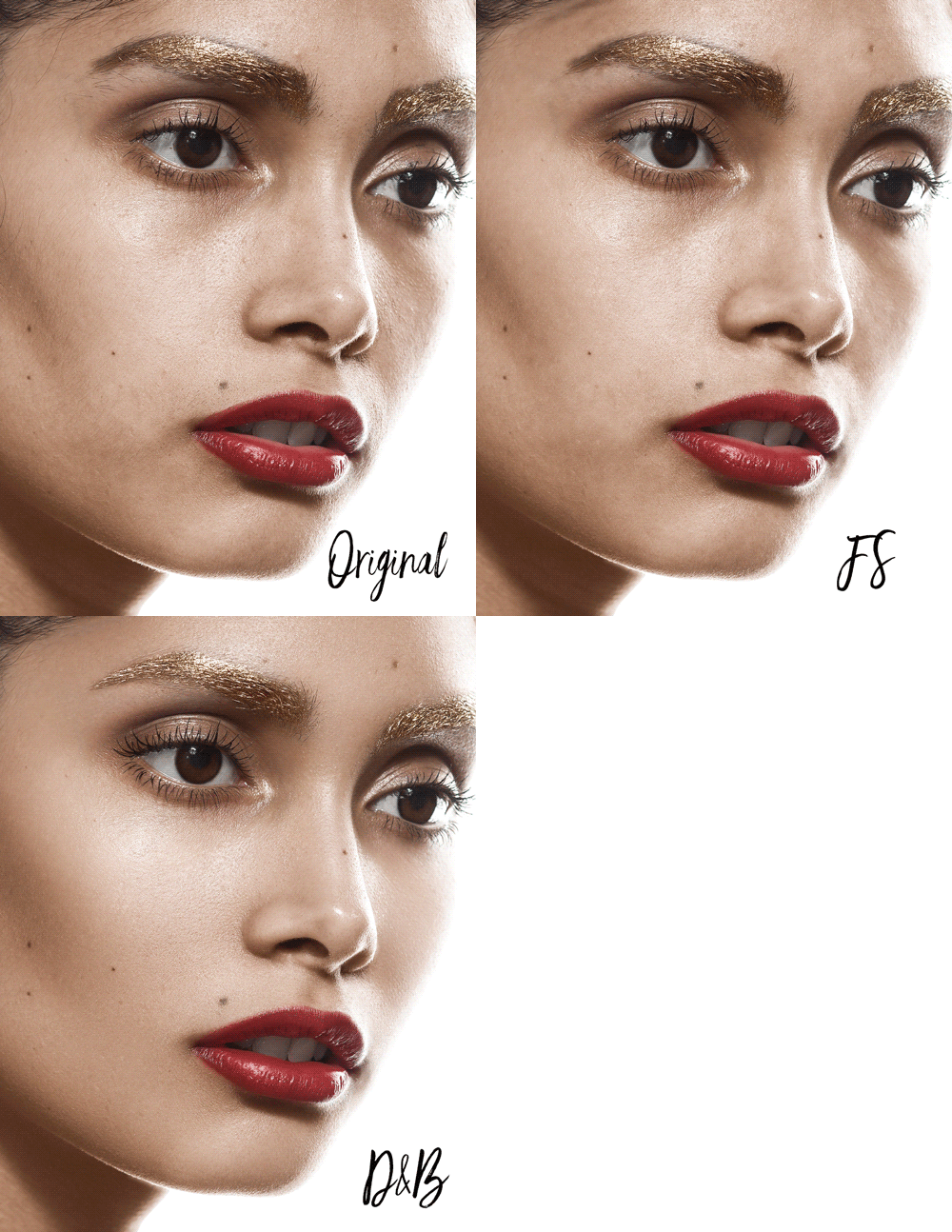
Original vs. FS vs. D&B results in my workflow. Image by Laura Bello.
This seems easy enough but it’s also where the artistic part of job comes in. It can take a while to develop an eye for what actually needs to be lightened or darkened. Models have different facial structure, and texture and lighting can greatly change how a face looks.
For example, trying to replicate strong cheek bones on a model with a rounder face will not look realistic. It’s about working with what you have and bringing out the best in each model.
There are a few things you can do to ease your way into learning what needs adjusted.
First, create a visual aid making the image black and white with a Hue/Saturation adjustment layer and then using Curves or Brightest/Contest can help to bring out the problem areas of an image.
Altering these adjustment layers can also help while working on different areas throughout the image; for example, lowering the brightness while working on the highlights of the skin.
Turning this group on and off to see the original toning helps as well.
Second, as you make changes, turning the dodge and burn layers on and off to compare to the original is a huge help as well.
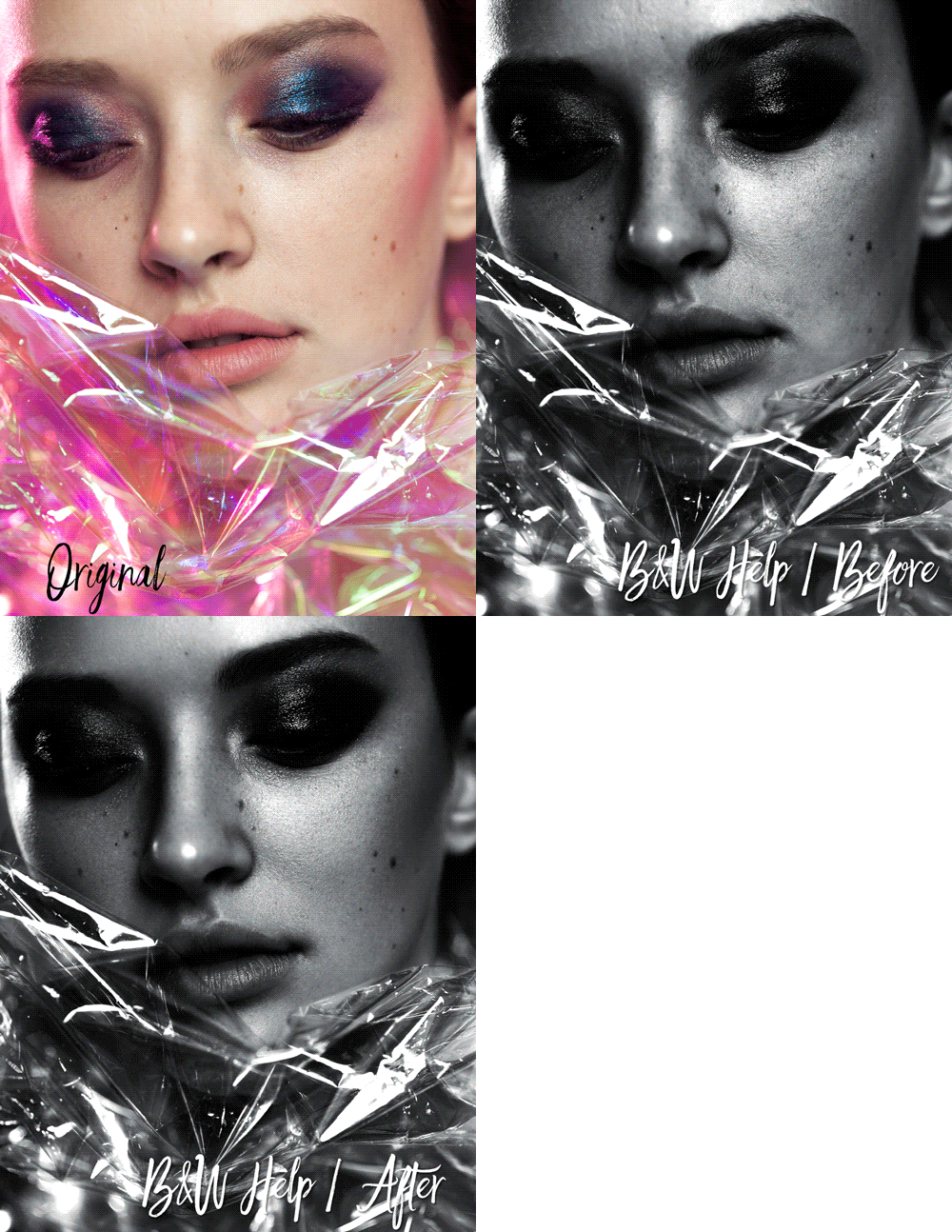
B&W Visual Aid for Dodging & Burning. Image by Laura Bello.
You want to perfect the image, while more would seem like a good thing it can be easy to get on a roll in the wrong direction if you’re not keeping track of the changes you’re making.
On occasion, I’ll even make a separate layer for specific lightening/darkening if I’m not sure how I’ll feel about making changes over good work I’ve already done. That can make it easier to undo something you’re not sure about without ruining your progress, although try not to get carried away making tons of layers!
WORKING EFFICIENTLY WITH THE RA PANELS
 The Beauty Retouch panel is a super handy retouching tool that makes it easy to set up your Dodge & Burn layers as well as black and white Visual Aid layers in a click of a button.
Check out the Retouching Academy video tutorials on how it is done with the Beauty Retouch panel here.
Third, don’t get stuck zoomed in at maximum while you edit. Along the same lines, being zoomed in too close for the whole procedure can lead to not realizing your edits are doing more harm than good until you zoom out.
Like painting a portrait, this process takes practice and a developed eye. It can be helpful to look at several similar reference images and take occasional breaks to get a fresh view while working.
Try not to make any drastic changes! Remember, you’re perfecting a model, not creating a whole new one.
Color & Tone
While this might seem like an afterthought when it comes to skin retouching, I actually find it to be the most challenging.
Using your color checker and calibrating all your gear certainly helps achieve a beautiful skin tone, it’s not as simple as that (that seems to be a bit of a theme, doesn’t it?).
Final tones and color vary widely from one image to another and it’s affected by many different factors. Lighting, model, mood, and even personal taste determines the finished product. When much of that image is composed of skin, it becomes an important part of post work.
Though, with thousands of different options it can be hard to pinpoint the perfect settings to best bring it out. Again, this is about the very basic concepts of art; color and contrast. The wrong toning can make images look flat or overly harsh and the wrong color and saturation can be off-putting.
This is something I still struggle with. Long after I finish all my dodging and burning, I’ll still find myself needlessly fiddling with adjustment layers trying to get things how I want.
There some tactics though that can help make the process a bit more straightforward.
Highlights, Shadows, and Midtones
Highlights, shadows and midtones are the three aspects that make up tones; these are what you want to change in post to make an image more dramatic or soft.
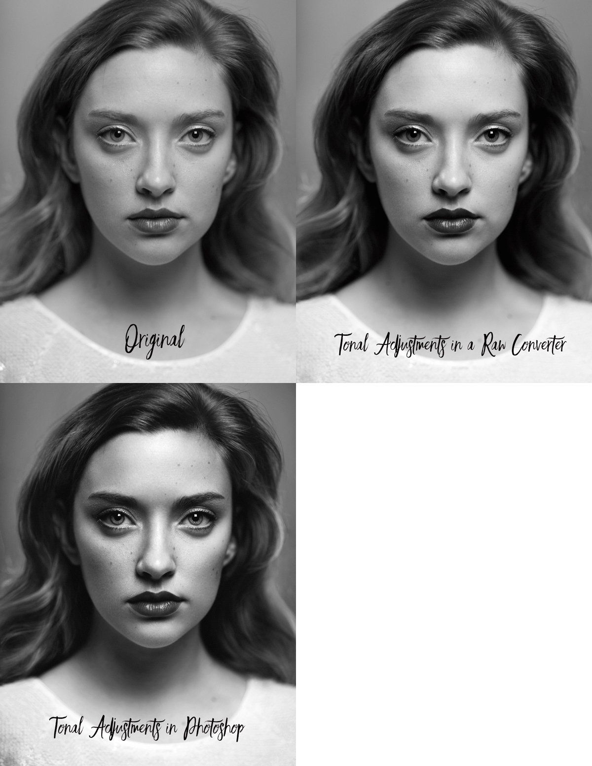
Tonal adjustments comparison. Image by Laura Bello.
There are many ways to go about this: Curves, Brightness/Contrast, Levels, Shadow/Highlight adjustments, etc.
However, using these adjustments can cause headaches if it’s correcting a problem in one area and creating one somewhere else.
Luminosity Masks and Masks in general are one way to get around this hiccup, however there’s another method that I prefer that’s a bit simpler and offers a bit more control.
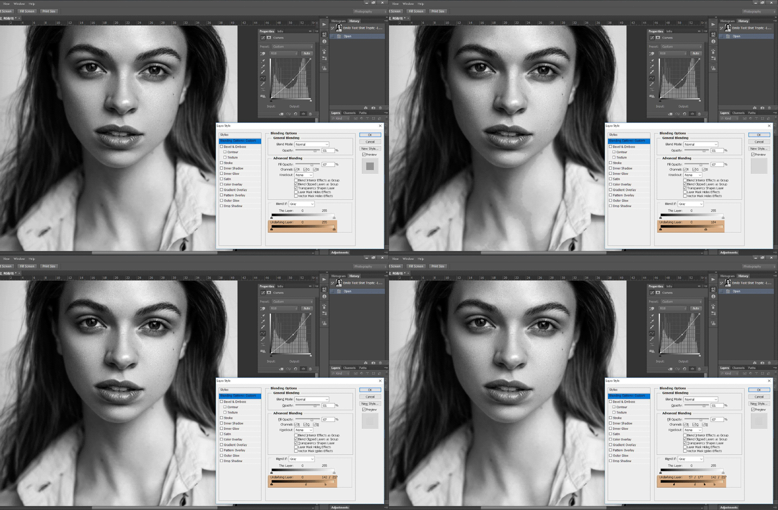
Tonal adjustments with Blend If. Image by Laura Bello.
In these images you can see I have a Curves adjustment layer darkening the whole image. Now, if I double-click on the layer it will open up to a dialog box that says ‘Blending Options’.
The slider at the very bottom is the one I’m interested in.
Moving the arrows left or right will affect what parts of the image are affected by the adjustment later. Changes look too harsh? Hold ALT and drag the arrow and it will split and create a gentler transition. You can also work on red, green, and blue channels specifically but it’s not a feature I use often.
This can help you use specific adjustment layers to brighten or darken specific tones, and I find it makes it a bit easier to mask out parts I don’t need to change.
Color
Using Gradient Maps to even out color are key to this part of retouching skin, but often much more than evenness is needed. A complexion that’s too red, yellow, saturated, etc. may look odd.
When adjusting skin tone, don’t simply make a gradient map of the current skin color and consider yourself done. Focusing on making the skin the most flattering color for each specific set of images is important as different shoots can have different color themes.
Skin that’s too pale can be unflattering in warm, summery looking images but conversely look lovely in darker, moodier themes.
Hue/Saturation, Curves, and Selective Color are all great options to make these adjustments but there’s really no straight forward way to make changes.
It’s often a process of knowing how the adjustment layers work and trial and error. Like tones you can use the ‘blend if’ slider trick to only affect certain areas of the skin if necessary, which can come in handy if you’re shooting with gels or you simply want to adjust only a small portion of the image.
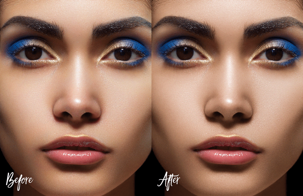
Color Adjustments with Gradient Maps. Image by Laura Bello.
Now, like all the other topics, color and tone retouching can seriously benefit from referencing other high quality images.
Don’t go as far as to reference an image shot with a beauty dish and try to tone your soft, natural light image that way. However, looking at similar images that are close to your personal taste can give you an end game to keep in mind while you work.
Also, again, helpful to turn adjustments on and off and step away from work to get a fresh view on what you’ve done.
Both these practices can keep you from going too far without realizing it, which can be irritating to undo.
Furthermore, I believe at some point you need to say, “That’s it, I’m done.”
I can get wrapped up in endlessly trying to make adjustments to an image but ultimately not making any improvements. Nothing will ever be perfect and you have to work with what you have. Having an eye for perfection is important when it comes to beauty work but obsession about achieving it can simply end in frustration.
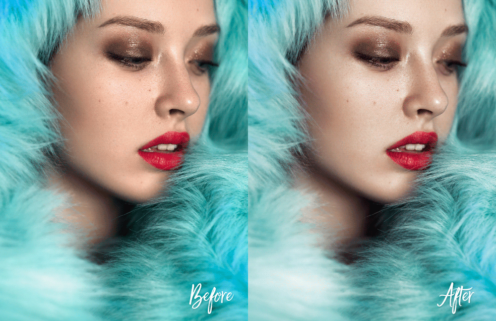
Color grading. Image by Laura Bello.
In closing, the art of perfect skin ties in very closely with the art of a perfect image, and why not, it is a very large part of beauty work!
Having a final vision in mind allows you to prepare critical aspects before you shoot and gives you guidance while you’re photographing. As a retoucher it helps make Photoshop work easier for you, knowing what changes need to be made helps you make them.
Combine this with study, practice, and utilizing the right tools and you’ll be much more confident in your path to beautiful skin.
While the end goal is effortless looking beauty, perfect skin can be a bit of a project. Loving the challenging process involved in creating this ever-so-eye-pleasing fantasy is, in the end, what makes a good beauty photographer and retoucher.
Beauty Retouching Workflow Checklist

A free PDF checklist for those who strive to be a better Beauty Retoucher








This has been so helpful. Am so grateful you’ve shared this with us. Thanks Laura
Really great article. Thanks for taking the time to explain things in such great detail in a way that is easy to understand.